Donate Icon: Enhancing Your Website's Fundraising Potential
The Importance of a Donate Icon
In the digital age, online donations have become a cornerstone of fundraising strategies for nonprofits, charitable organizations, and even individuals seeking to support causes they are passionate about. A prominent and well-designed donate icon on a website can significantly boost donation rates by providing an easy and intuitive way for visitors to contribute. This icon serves as a call to action, encouraging visitors to take immediate steps towards supporting a cause.
Design Elements of an Effective Donate Icon
An effective donate icon should be visually appealing and strategically placed to catch the visitor's attention without being intrusive. The design should align with the overall aesthetic of the website, ensuring consistency and a seamless user experience. Key design elements include:
Color and Contrast: The icon should stand out against the background of the website. Bright, contrasting colors such as red or green can draw attention and create a sense of urgency. However, it’s important to balance this with the website's color scheme to avoid clashing.
Size and Placement: The size of the donate icon should be large enough to be noticeable but not so large that it overwhelms the content. Placement is crucial; common spots include the top navigation bar, the footer, or a fixed position that scrolls with the user.
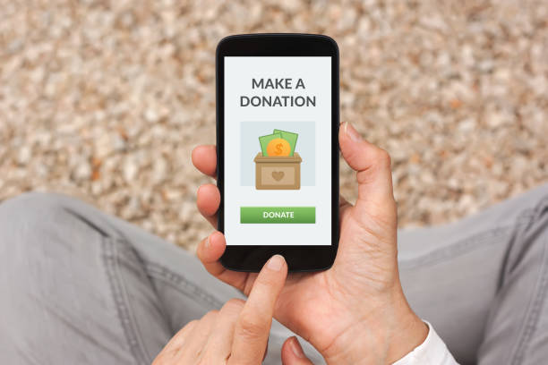
Text and Icons: Including a universally recognized symbol such as a heart, dollar sign, or hand can help convey the purpose of the icon quickly. Accompanying text like “Donate Now” or “Support Us” adds clarity.
User Experience and Accessibility
A donate icon should enhance the user experience, making the donation process as straightforward as possible. This involves:
Clear and Simple Navigation: Clicking the donate icon should lead to a donation page that is easy to navigate, with clear instructions and minimal steps required to complete the donation.
Mobile Responsiveness: As many users access websites via mobile devices, the donate icon and subsequent pages must be optimized for mobile viewing. This includes ensuring buttons are large enough to tap easily and that forms are not cumbersome to fill out on a smaller screen.
Accessibility Considerations: Ensure the donate icon is accessible to all users, including those with disabilities. Use alt text for screen readers, and consider colorblind-friendly design choices.
Psychological Triggers and Persuasion
Incorporating psychological triggers can increase the effectiveness of a donate icon. Techniques include:
Urgency and Scarcity: Phrases like “Donate Today” or highlighting limited-time matching donation campaigns can create a sense of urgency.
Social Proof: Displaying recent donations or testimonials can encourage others to donate by showing that others are supporting the cause.
Emotional Appeal: The use of imagery and stories that evoke empathy can compel visitors to take action. Pairing the donate icon with impactful visuals or narratives about the cause can enhance its effectiveness.
Integration with Fundraising Platforms
Seamless integration with fundraising platforms is essential for a smooth donation process. This involves:
Payment Gateways: Ensure compatibility with popular payment gateways such as PayPal, Stripe, or direct credit card payments. Offering multiple payment options can cater to donor preferences and increase conversion rates.
Security and Trust: Highlighting security features such as SSL certificates and secure payment processes can reassure donors that their information is safe.
Recurring Donations: Provide options for one-time donations as well as recurring contributions. This can be presented during the donation process as a simple checkbox or additional option.
Analytics and Optimization
Tracking and optimizing the performance of the donate icon can lead to better results. This includes:
Analytics Tools: Use tools like Google Analytics to track clicks, conversion rates, and the overall performance of the donate icon. This data can provide insights into user behavior and areas for improvement.
A/B Testing: Experiment with different designs, placements, and messages to determine what resonates most with your audience. A/B testing can help refine the approach and maximize donations.
Feedback and Improvement: Regularly solicit feedback from donors about their experience. This can uncover pain points and opportunities to enhance the donation process.
Case Studies and Examples
Looking at successful examples can provide inspiration and practical insights:
Nonprofit Organizations: Many nonprofits have mastered the art of online donations. Analyzing their strategies, such as the placement of the donate icon on the American Red Cross website or the streamlined process used by UNICEF, can offer valuable lessons.
Crowdfunding Platforms: Platforms like GoFundMe and Kickstarter utilize prominent call-to-action buttons to drive contributions. Their techniques for engaging users and making the donation process simple and transparent can be applied to any website.
Conclusion
A donate icon is more than just a button on a website; it is a gateway to supporting meaningful causes and driving positive change. By focusing on design, user experience, psychological triggers, integration with fundraising platforms, and continuous optimization, organizations can significantly enhance their fundraising efforts. A well-placed and thoughtfully designed donate icon can make the difference between a visitor and a lifelong supporter.